CLIENT LAUNCH: Michael Belmore’s website live at www.michaelbelmore.com
When working with artists to design a digital presence that showcases their work it is always a welcomed challenge to design a layout where the design fades unobstructed into the background, foregrounding the actual work of the artist.
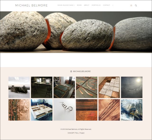
With Michael Belmore (www.michaelbelmore.com) there was the added challenge of designing a space that allows for the natural materials he works in – stone and copper – to emanate from the interface of the screen. With regards to the texture of the rock combined with the warm glow of copper, I want the user to be able to sense how it would feel to touch the cool stone as well as smell the lingering scent of the minerals locked in the rock.
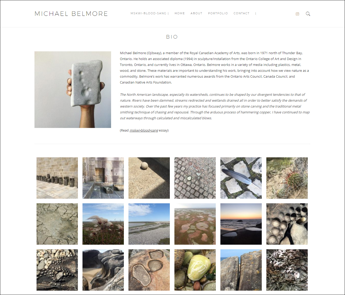
It was a pleasure to work with the images Michael provided of his portfolio but I was also always intent on finding a way to work in the imagery of his journeys. Inside his cell phone is an image bank of landscapes ranging from urban spaces where humans have intervened with rock as well as images of the unpredicted aesthetic of nature’s own interventions. His visual studies of Portugal capture the odd beauty of the softening down of stones at the edge of a moody Atlantic.
Another important part of digital design for artists is to curate an experience for the user that will lead them to information that frames their understanding of a client’s work. On Michael’s website the expected navigation – Home, About, Portfolio, Contact – was tweaked in order to encourage the user to visit the link mskwi-blood-sang first. The page highlights an essay by writer / curator Alexandra Kahsenniio Nahwegahbow for Michael’s exhibition of the same name. The exhibition,that opened the 2017 year at the Karsh-Masson Gallery in Ottawa, featured new work as well as the older work that Michael is known for, the at once sensually rough and smooth union of rock and copper.
Liminal sites, such as shorelines that mark the threshold between opposing elements of water, and the earth and sky – like liminal states of beings, as in the dream between sleep and awake – are spiritually active places. In the Anishinaabe world view, the universe is understood to be comprised of layers. Divided into contrasting upper and lower worlds and zones of power, this tiered cosmos is animated by the ongoing and reciprocal interaction of beings and persons both natural and spiritual.
(read full essay here)
The final design choice pulls all the desired elements together as well as integrates Michael’s Instagram feed! He has a fantastic one (@michaelbelmore) where he shares with the viewer that incredible image bank of his world and the inspiration behind his work.
For more of Michael’s portfolio visit www.michaelbelmore.com.


No Comments